
If Your Website Feels Confusing, Think of a Grocery Store
Designing a website can feel overwhelming, but it doesn’t have to be. One of the best ways to simplify the process is to think of your website like a grocery store. Yes, a grocery store.
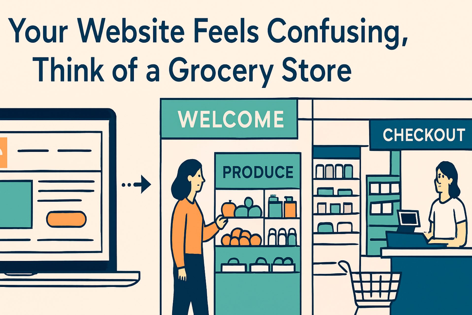
When you walk into a well-designed store, you’re not guessing where to go. The entrance is welcoming, the signs are clear, and the layout makes sense. You’re guided from fresh produce to packaged goods, from frozen items to checkout—all without needing a map.
This is exactly how your website should feel.
Here’s how to break it down:
The Entry: First Impressions Matter
Grocery stores usually greet you with colorful displays or irresistible deals. Your website’s homepage should do the same.
Ask yourself:
✅ Does it clearly show who you are and what you offer?
✅ Is it inviting and visually appealing?
✅ Does it encourage people to keep “walking” deeper into the site?
Aisles: Organize Your Information
Imagine if cereal, laundry detergent, and bananas were all on one shelf. Total chaos, right?
Websites work the same way. Your content should be clearly grouped—services, products, about, contact—like clean, labeled aisles.
Ask:
✅ Can users find what they’re looking for in seconds?
✅ Are your navigation menus simple and logical?
Product Placement: Highlight What Matters
Just like stores place high-margin items at eye level, your site should highlight your key offerings and calls to action.
Whether it’s “Book a Demo,” “View Menu,” or “Shop Now,” make it front and center.
Ask:
✅ Is your most important content being overlooked?
✅ Are calls-to-action placed where visitors will see them?
Checkout: Make It Easy to Convert
The best stores get you in and out without hassle. Your site’s “checkout” could be a contact form, purchase button, or reservation system. It should be smooth and simple.
Ask:
✅ Is it easy for visitors to take the next step?
✅ Are you reducing friction wherever possible?
At Go Gonzalez, we help businesses design websites that guide visitors the same way great stores guide shoppers. Clear. Organized. Purpose-driven.
So, if your website feels like a maze—think of your local grocery store. The layout isn’t accidental, and your website shouldn’t be either.


Leave A Comment